ASCII Art & Unicode
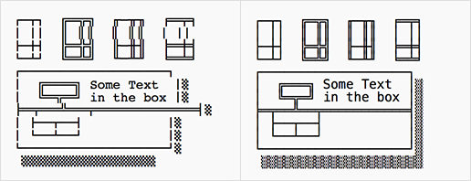
ASCII art, or more generally text-based art, uses characters to represent pictures. It is crucial that such pictures are rendered using a monospaced font, otherwise they would appear misaligned. But even if they are displayed using a fixed-width font, things can go wrong when using Unicode characters, like in the example from Wikipedia below (running on OS X 10.9; left side shows default rendering while right side shows the correct behaviour). Let's investigate the problem.
The Character Grid
ASCII art depends on the usage of a monospaced font because it is what allows us to perfectly align characters. This stems from the fact that each character's width is exactly the same (or rather, the advancement for each character is constant). This can be visualised as a 2D grid of character boxes, each of which can contain a single glyph.
After we revealed Monodraw, we received multiple reports that the robot art at the bottom of the page did not display correctly. As we explicitly set the font to Menlo, which is included as part of Mac OS X, we never noticed any problems ourselves during testing across all browsers.
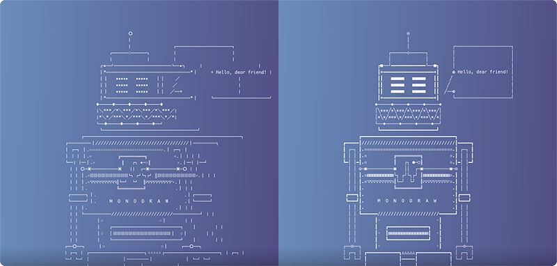
I knew that the problem was related to the font but I did not know what the exact issue was. Next up, I wanted to confirm whether the misalignment arose from the way browsers rendered the text, so I opened the robot in three different text editors (TextEdit, TextMate and Sublime Text). Sure enough, the robot appeared misaligned in all of them when rendered using Monaco but completely fine when using Menlo.
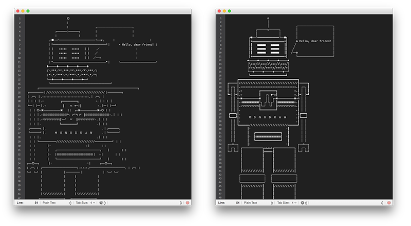
Hmm, now that's a bit puzzling. We could draw the conclusion that the font used somehow affected the character grid but it was unknown whether it was caused by the font itself or some other side effect. Consequently, I downloaded Glyphs and checked the font metrics of both Menlo and Monaco – everything looked fine. It was time to go down another level and render the robot directly using Core Text and carefully inspect the resulting text layout.
The culprit was immediately revealed – font substitution! It was so obvious in retrospect, the font used to display the robot did not contain glyphs for specific characters, so a different font was substituted for particular ranges of the text. Even though the fallback font might have been fixed-width as well, it would most likely have had a different advancement and thus misaligned the character grid.
Monodraw & Font Substitution
It is very important for Monodraw to be able to correctly handle issues related to the display of ASCII art and ensure that pictures you have created get rendered perfectly when viewed outside the app. There are two aspects when it comes to font substitution – giving you feedback if an issue might arise and providing you with a solution.
Firstly, Monodraw does not use font substitution and it will highlight missing glyphs in red. Secondly, the document can be configured to only use ASCII characters or tap into the Unicode box-drawing characters when rendering the standard shapes. Check out both features in the screencast below!

 You should follow @milend for more.

