Monodraw: Progress Update #2
It is time for our second Monodraw beta progress update. I have been busy implementing some very important changes that have significantly increased the app's utility and usability. Let's take a detailed look at what has been happening over the past few weeks.
Time Frames
I know a lot of people just want to find out when the public beta will ship. Our stance on the topic has always been – it's done when it's done. As we slowly but steadily complete more of the tasks left for the launch, we are getting a slightly better idea about the time frames.
We have just announced our lab programme, so if you want to be one of the first people to get your hands on Monodraw, sign up. At the moment, it seems that I have about two weeks worth of work left until the app is in a state to be distributed to the lab participants – my personal aim is for this to happen before the end of the year.
Once we have shipped the alpha, there is one major feature left for the beta – a special tool that we have kept secret, which we will reveal when the beta launches. Once 2015 rolls around, we will be at the final 10% but as it usually happens, those last few bits of work might take a disproportionate amount of time. Depending on how we progress over the next few months, we are hoping to ship the beta in the first quarter of 2015.
Line Tool
One of Monodraw's main goals is to make common operations very easy thus saving you time. When using ASCII art to draw diagrams, lines are used to connect the various shapes. I completely changed the way they work, so you automatically get the right behaviour in almost every case. And for the rare times when the app cannot guess your intentions, full manual control is avaiable – the best of both worlds.
Before I describe the changes, we need to revisit how lines worked up until now. We used to have two types, orthogonal and step. The line itself had a starting orthogonal direction (whether it will firstly go along the X or Y axis). There were two major problems with this approach:
- If you wanted to connect two sides of a rectangle, you needed to manually add a midpoint so that the line directions on both ends are perpendicular to the rect sides. This adds a large amount of friction for every single connecting line – clearly, the app should be doing this for you, not the other way around.
- Leaving the user to decide the starting orthogonal direction is unnecessary in the majority of the cases. We can infer the starting direction from the line points and any preferred directions from the line's attachments.
To resolve all of these problems, I removed the starting direction and introduced four different modes which fully determine a line's behaviour:
- Diagram (orthogonal): mode designed to automatically connect endpoints. Everything is inferred and the line will add invisible midpoints as necessary to satisfy the preferred directions of the endpoints.
- Automatic (orthogonal): mode designed for automatic segment directions but with manual midpoint control. The user has full control over the midpoints (how many and where) but the segment directions are inferred from the positions of the midpoints.
- Manual (orthogonal): mode designed for full manual control of both the midpoints and the segment directions.
- Step: step lines.
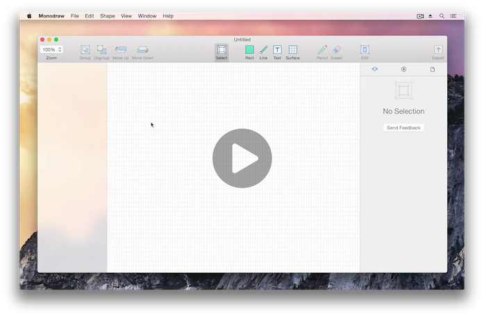
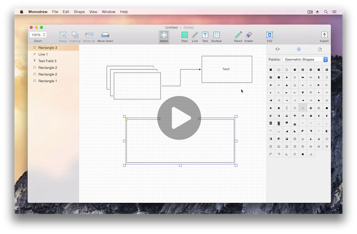
You might have noticed that lines' automatic behaviour depends on the endpoints' preferred directions. How are those determined? You don't have to do anything for built-in points as those work out of the box – for example, rect attachment points prefer perpendicular directions to their respective sides. For custom points, you can manually set the directions via a contextual menu thus giving you full control – a point can have multiple preferred directions, all of equal priority. Check out the screencast below for all of the new functionality.

Pencil Tool
The pencil tool allows you to "paint" characters using the mouse and up until recently, using it was confusing for several reasons:
- There was no interface to show the current character (analogous to the current colour in graphics software). This made it almost impossible to use, as you never knew what character will be applied when you switched to the tool.
- It was unclear how to set the current character. In practice, the pencil used the first character from the clipboard – completely opaque and unintuitive, it was a placeholder solution put in place while developing the tool.
- It was unclear which shapes the pencil applied to. In practice, it painted the currently selected shape but there was no visual indication and during some preliminary testing, users were confused by this.
All of the above problems were resolved by making the following changes:
- The current character is drawn next to the crosshair cursor, so you are always aware of what it is.
- Each document has its own current character and it can be set in three ways (while the pencil tool is active): by typing a character using the keyboard, by using the character palettes or by pasting the clipboard contents (it will pick up the first character). Monodraw will no longer implicitly use the clipboard for the current character and the behaviour is predictable and constitent.
- When the pencil tool is active, all shapes except the currently selected one are faded out and smart points become visible even before painting has began.

Text Tool
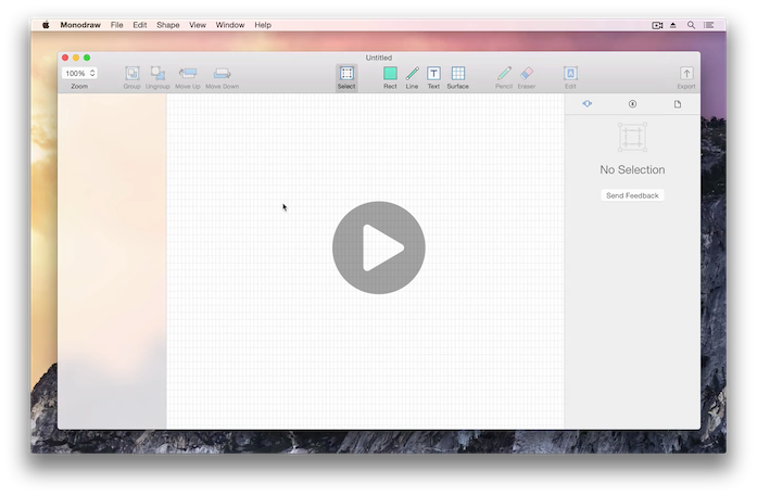
The text tool introduces an interesting conundrum because editing can mean two different things – editing the text or the shape itself. The intuitive and consistent behavour is to always edit the text first but we must also provide an alternative way to edit the shape – this is done using a popover. This approach removes any confusion that might arise when dealing with text fields, as the screencast below demonstrates.

Notable Changes
I made lots of other changes, some of the more notable ones are:
- Zoom support – it's sometimes handy to be able to concentrate on a particular part of the canvas. You can zoom using keyboard shortcuts, the toolbar or by performing a zoom gesture on your touchpad. Window state restoration is used persist the zoom value even after you close the document.
- A significant performance optimisation related to the way data is stored internally. This has had a knock-on effect and multiple operations became much quicker (copy-paste, pencil drawing and direct editing). I treat high performance as a feature and Monodraw is designed from the ground up to be fast.
- Monodraw can now open text files directly, it will create a new document having a single surface with the contents of the text file. You can import the contents of a text file into the current document, too.
- The file format has changed so that sizes are significantly reduced, making it more friendly to use with cloud services like Dropbox.
- Hovering over a position anchor now indicates that they are draggable by changing the mouse cursor – it was previously unclear that those anchors are moveable.
- When a tool is activated, the mouse cursor will change to show the shape being created. Previously all tools used the same crosshair cursor. (@amahony)
- You can now ⌘-click to select the deepest shape, ignoring any groups. This is now in addition to double-clicking to select shapes inside the deepest, currently selected group.
- ⌘-1,2,3 will select the first, second or third tab, respectively, in the assistant.
- Holding the Option key (⌥) while using the toolbar buttons "Move Up" and "Move Down" will change their behaviour to "Move to Front" and "Move to Back".
- Tooltips are consistently used throughout the app to explain functionality and show any keyboard shortcuts. For example, all tools in the toolbar have a single key shortcut shown in their tooltip.
- "Smart Points" (introduced in our first beta update) can now be toggled on or off. The rationale is that they can sometimes interfere when you want to edit a shape and just get in the way.
- Animations can be turned off (separate toggles for the sidebar and the assistant). If you use the app for prolonged periods of time, those animations can become a bit annoying, so you can now easily disable them.
- A feedback button was added when there is no selection, as we want to make it easy to provide feedback – it should be obvious how to do it, not forcing users to hunt the menus.
Thanks for reading this far – until next time!
 You should follow @milend for more.

